YEAR
2018
COMPANY
Pawoon
ROLE
UI/UX Designer
INDUSTRY
SaaS
SUMMARY
Pawoon is a Cloud-Based Point-of-sale system that helps SMEs run and monitor their business more effectively.
I led the end-to-end design for Pawoon core products like Mobile and Tablet Point of Sale and Customer Backend dashboard, as well as supporting apps like Waiter app and e-commerce.
I revamped Pawoon's core products, ensuring brand alignment, boosting user experience, and driving widespread adoption among SMEs.
device
Desktop, Tablet, Mobile App
PLATFORM
Web, Android

Overview
Back in early 2016, I was the first 5 employees at Pawoon and was the only designer at the time. I started the journey of designing and nurturing the product from the beginning, witnessing the company's journey from 5 people to hundreds of employees within just a few years and secured the series A fund in 2017.
I led the design for the core product Point of Sale and Merchant Dashboard as well as helped the company ideate and create supplementary products like the waiter's app and e-commerce. It was a fun journey for me personally, to be able to nurture the product and see how it grows and the fact that I see my product is used by a lot of merchants when I purchase something on my local market was another happiness in itself.
When the first time I joined the company, I was served with the initial MVP product, which was not really thought of in terms of design, it works functionally however there are so many usability issues and the visual design was not in line with the company brand and values itself. So the goal when I joined the company is to completely rebrand the visual design, fixed a lot of usability issues, and improve the overall user experience to boost user growth.
Users
Business Owners
Cashier
Waiter
Challenges
There are many problems at that time, these are few problems i want to share on this case study.
The App UI look and feel doesn’t inline with the company’s brand and values.
Many users unintentionally type their email incorrectly during registration.
Unstructured product management page.
Low product creation.
How do I know if the above was a problem?

Design Process

The diagram above illustrates that the design process is highly flexible. If the problem at hand requires a quick-fix solution, I can directly jump into UI design and start prototyping. However, if the issue is complex and demands a more intricate design or interaction, I follow the wireframe-first approach to receive initial feedback. After everything seems fine, I move into the higher fidelity stage. The multiple arrow on the diagram indicates the ability to switch between the two approaches depending on the problem's complexity and requirements.
Research Methods

Each research method is used according to the situation and the research goal.
Wireframe
Since the back-end system is quite complex, I designed the back-end system by creating interactive wireframes using Axure RP. This wireframe is used to validate the concepts much quicker and to make changes at a faster speed; since it is interactive and clickable, I also test the wireframe with the user for usability testing and to get their feedback. This process helps us design the concept much more quickly and get feedback faster.


Problem and Solutions
Below are a few specific problems and solutions I would like to highlight in this case study.
Problem 1:
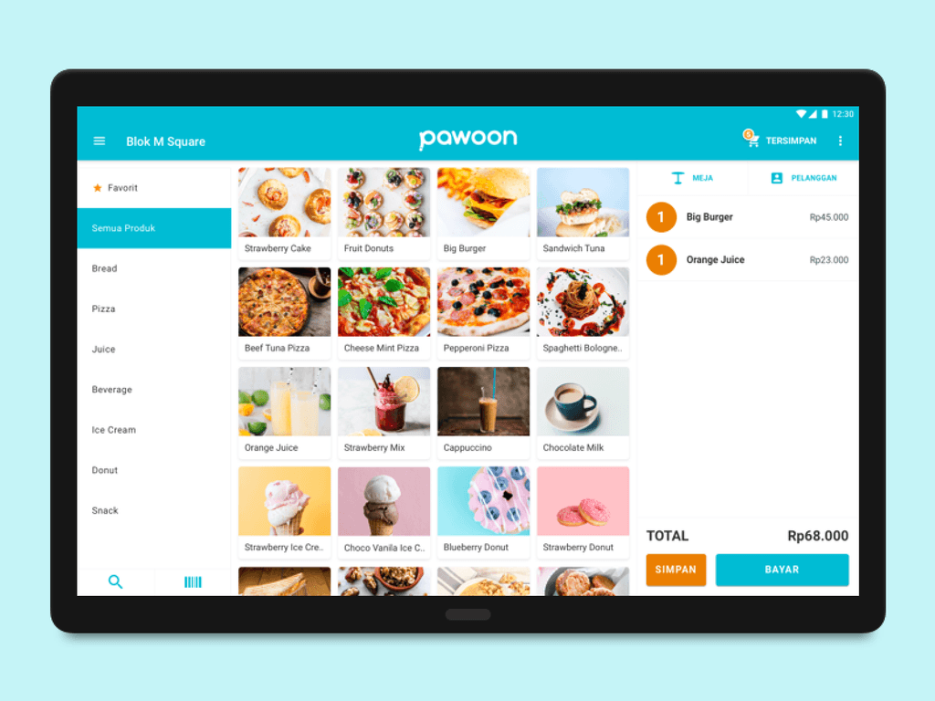
The App UI look and feel aren’t in line with the company’s brand values
Pawoon wants to be a simple to use point of sale, professional by looking but keep casual. However the old version of Pawoon app UI, it was very old fashioned to convey that message. I also found many usability issues with the old UI and branding inconsistency as well. I had discussion with the CEO regarding this, and we come to an agreement to redesign the app to better deliver value to our users.

Solution:
Look and feel redesigned.
I redesigned the overall look and feel of the Pawoon app to be more in line with the company brands and colours. The goal is to make the app simpler and easier to use and look more professional yet young and casual since many of our users are “young” people. I also simplified some UI elements and hidden less-needed ones, like making the search bar optional to save more space because, based on my observation, the search bar is only used occasionally.

Problem 2:
Unstructured product management page
Pawoon also has a back-office system that customers use to manage their business, from managing products, adding employees, managing inventories, etc. One of the most significant critical pages is the add product page. Based on my observation, some usability issues are found on this page. The old version of this page consists of many forms, but the structure is also not very well categorised. So, I try to come up with a solution to tackle this problem.

Solution:
Look and feel redesigned.
I addressed the problem using progressive disclosure. I tried to simplify the add product page, hide less prioritised elements, and still allow the user to access it. I added some tooltips to help the user understand the field. I prioritised what was most important and less important in the hierarchy. After redesigning it, I observed tremendous positive improvements in terms of usability compared to the old design version through Hotjar session recordings.

Problem 3:
Incorrect email data during registration
Email is an essential part of user data. Unfortunately, many registrations involve incorrect email entries, which creates a problem for the team and increases the number of support tickets.
Solution:
Ask the user to confirm the email during account registration
There are many reasons why users do not confirm their email addresses; one reason I found was that they have typos in their emails. We received many reports from the customer service department regarding this issue. So, I came up with this solution: On the sign-up page, after the user fills out the form and clicks the sign-up button, it reminds the user whether the email they have entered is already correct or not.

Problem 4:
Low product creation
Adding products is an essential part of the business process, if the product hasn't been set up then the customer cannot sell or make a transaction through the Point of Sale app, and it is also important for the user to try the Point of Sale app on tablet or mobile phone however the product is needed, so adding a product is very critical. However we find many accounts didn't add much product, it means that after registering their account they are not adding their product to the system.
Solution:
Let the user add product during the onboarding
The solution to encourage users to add a product is to prompt them to do so during the onboarding process. To simplify the process, only the product name is required, but users can still provide additional details such as category, price, and product picture. The purpose of this is to engage users with the platform and ensure that they have at least one product already added when they land on the dashboard. This allows them to try the Point of Sale app on their mobile or tablet and see the product they have created. This process also teaches users that any product they add in the backend system will appear on their mobile or tablet app. As a result of this change, we have seen positive improvements in the first product added metrics.
